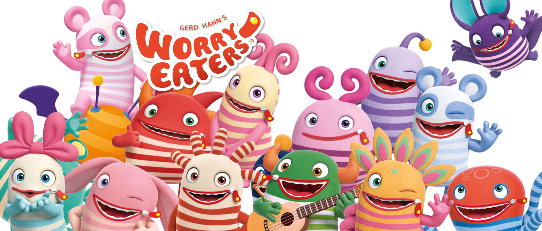
Based on an idea by Gerd Hahn. Most famous for the stories of Mia and Me and the Worry Eaters.
TV Series • 2D Animation
26 x 22'
26 x 22'
Produced by Hahn Film (Germany), KiKA (Germany)
Broadcaster KiKA (Germany)
Broadcaster KiKA (Germany)
PLOT
TOM and LISA are the twin Guardians of a family secret: Hidden in the amazing history museum of their grandmother Eleanore is an invention by their legendary ancestor Jules Verne: A TIME MACHINE! But unfortunately, their vain Uncle Randolf has found meddling with history to be an irresistible shortcut to his own fame and fortune!
Follow Tom and Lisa as they help Shakespeare, Vivaldi and Einstein defend their outstanding creations against this time-travelling trickster. Get ready to make history!
26 episodes, 26 different locations and 26 different eras
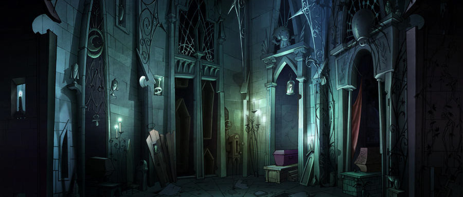
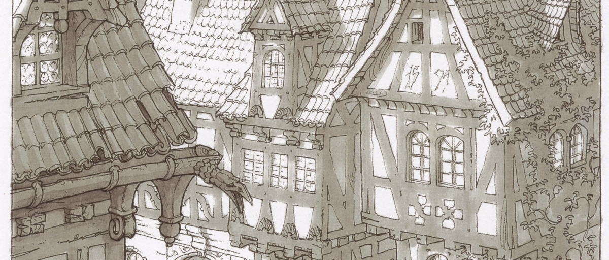
My job was to create a brief for an Asian studio that served as a guide for the characters, sets, colors, textures and lighting for all 26 episodes.
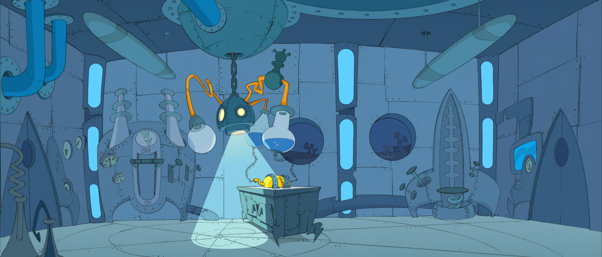
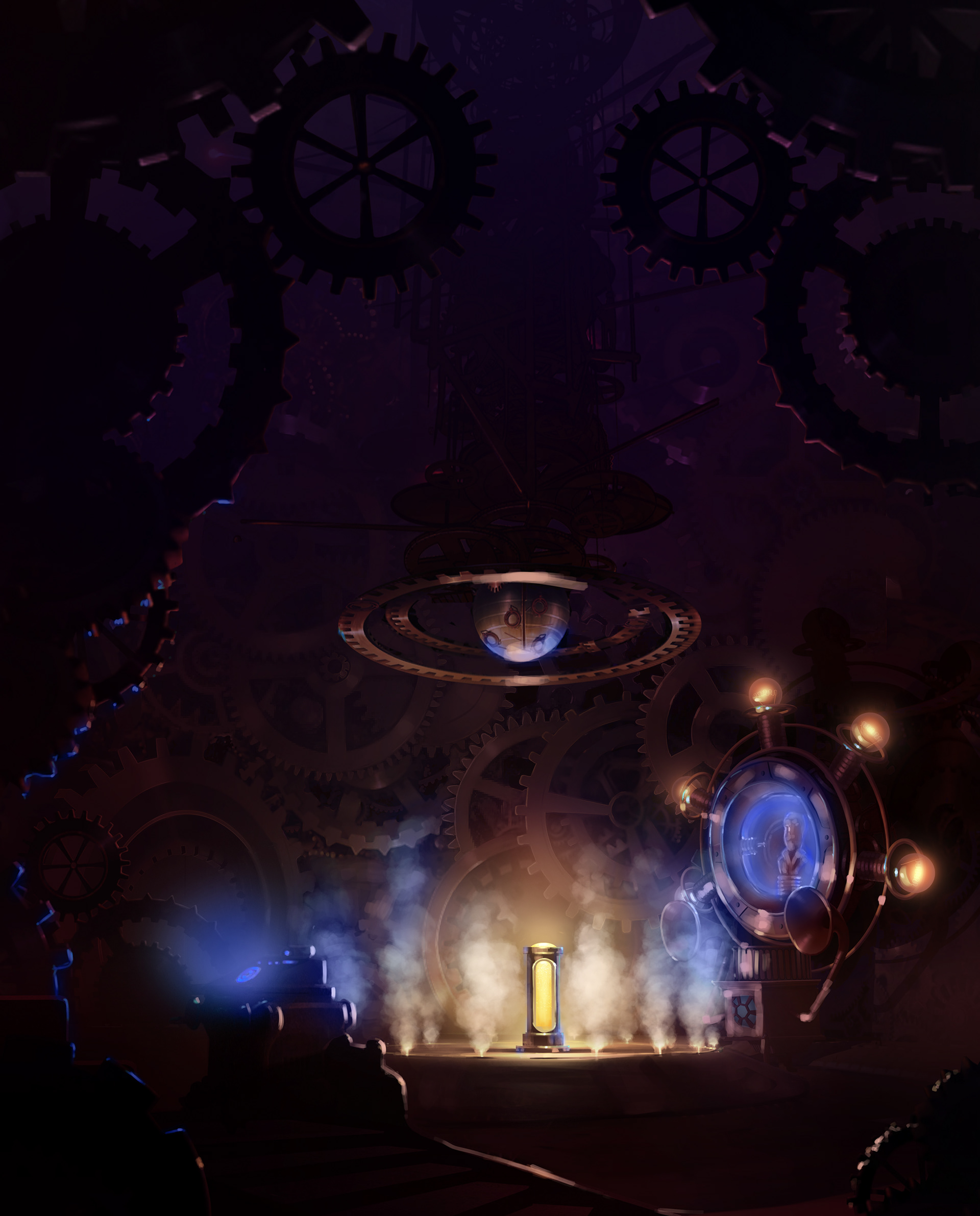
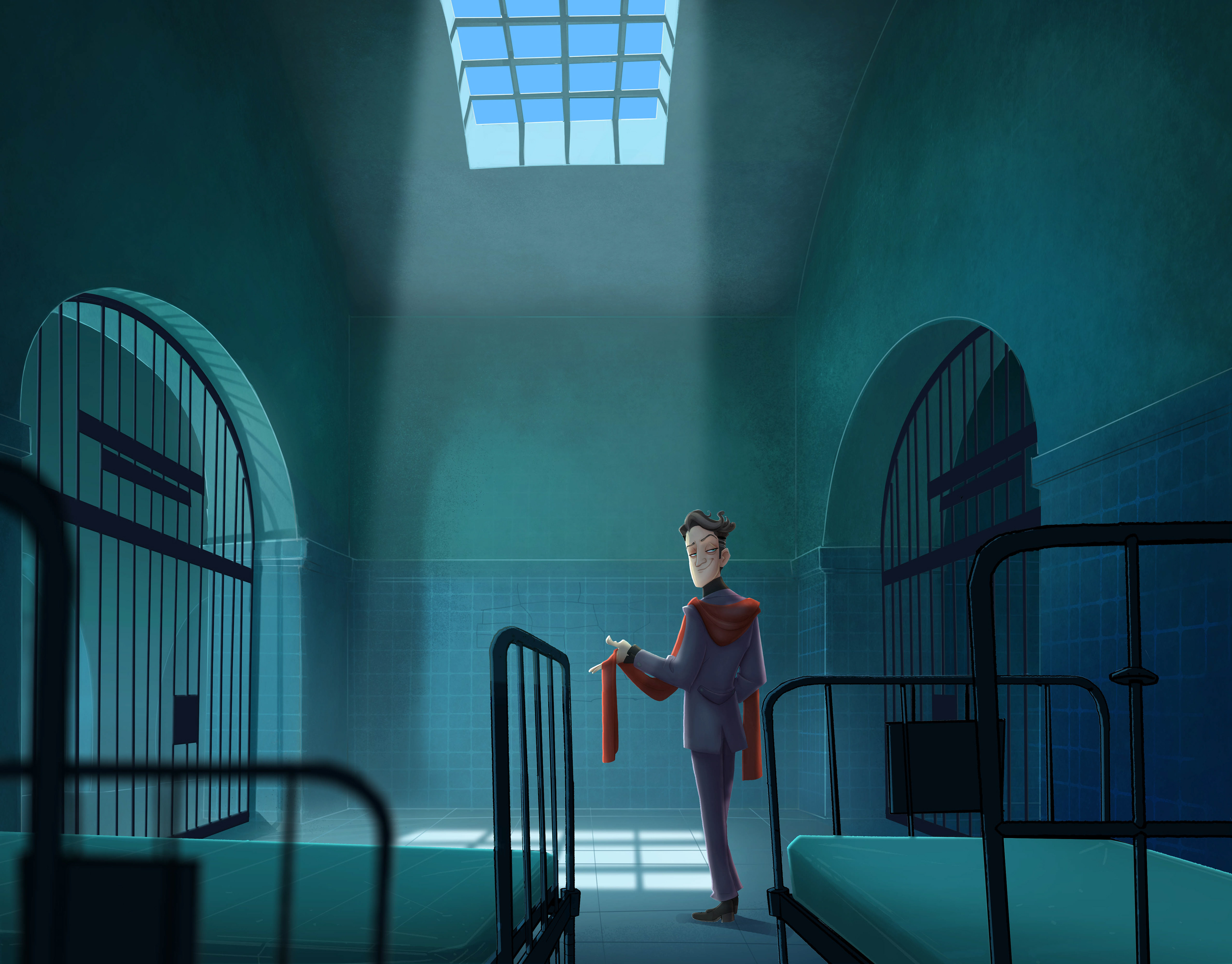
The biggest challenge was that each episode was set in a completely different time and a completely different place. A major challenge in terms of the art direction. After all, it's about people from contemporary history. From Vivaldi to Einstein and from Amundsen to Robert Koch. So every show with new costumes, other sets, different props. The most modern episode is about the moon landing and the oldest is about the invention of paper in China. Only the mystery museum remained the same in all episodes. With the exception that the exhibitions in the museum changed according to the theme of the episode. What an artistic journey.
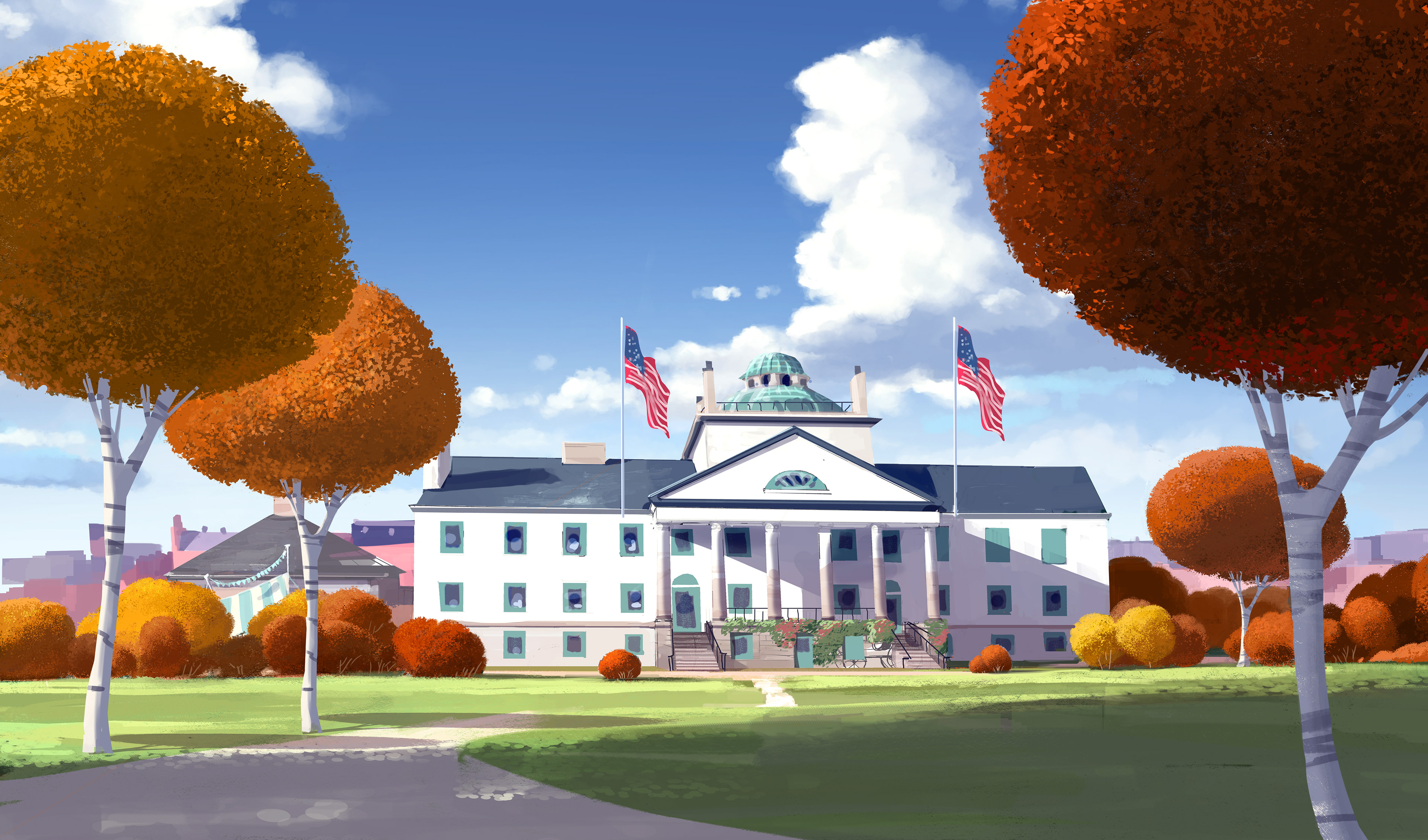
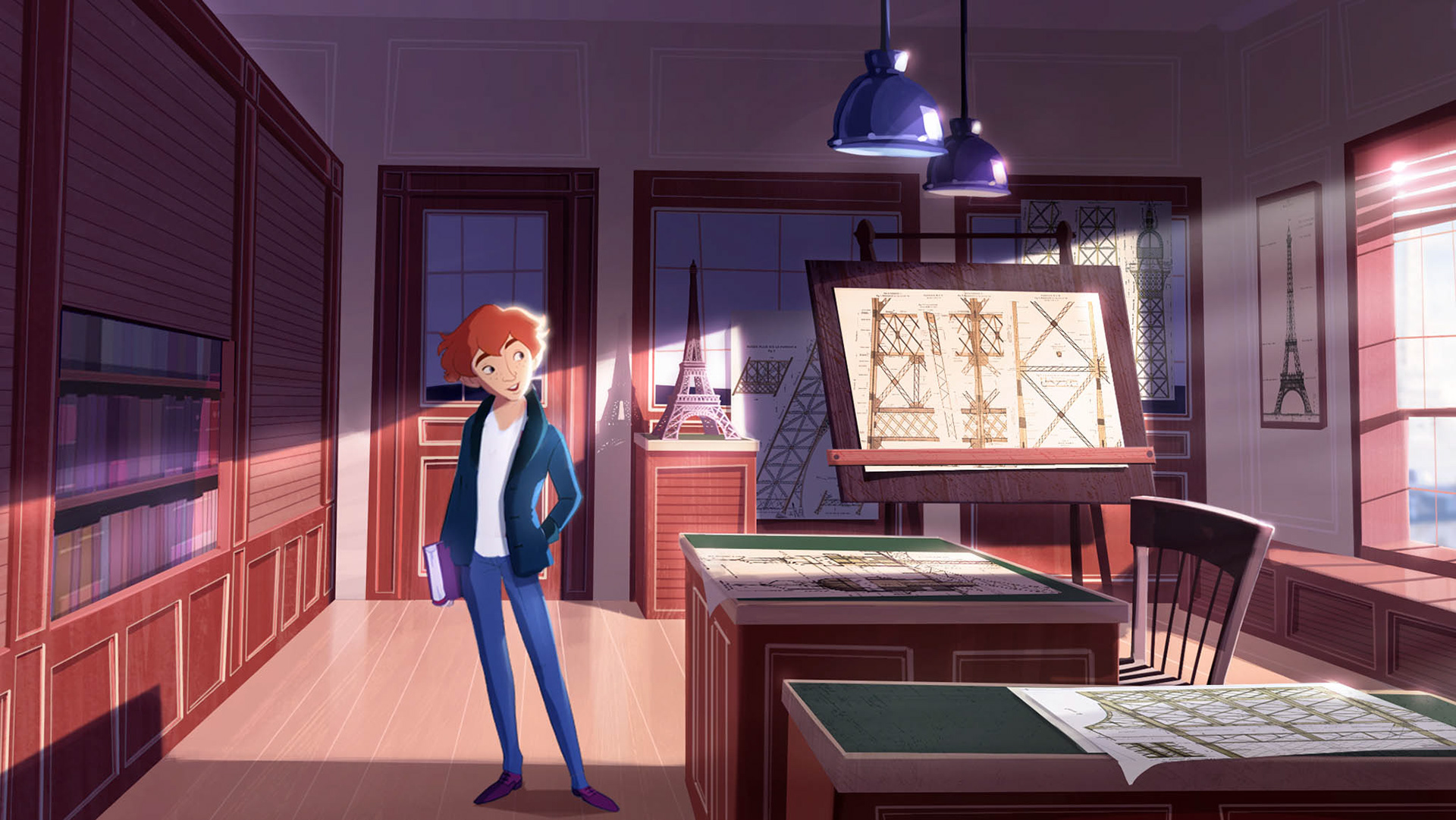

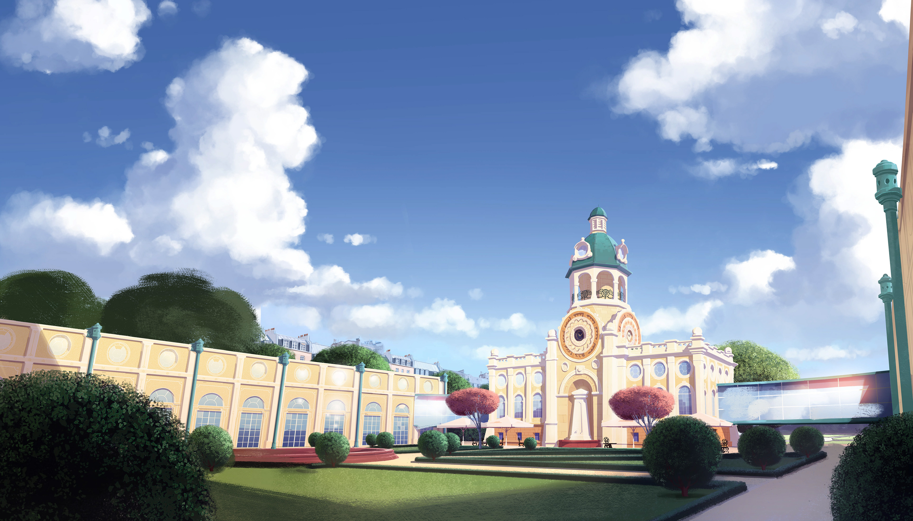
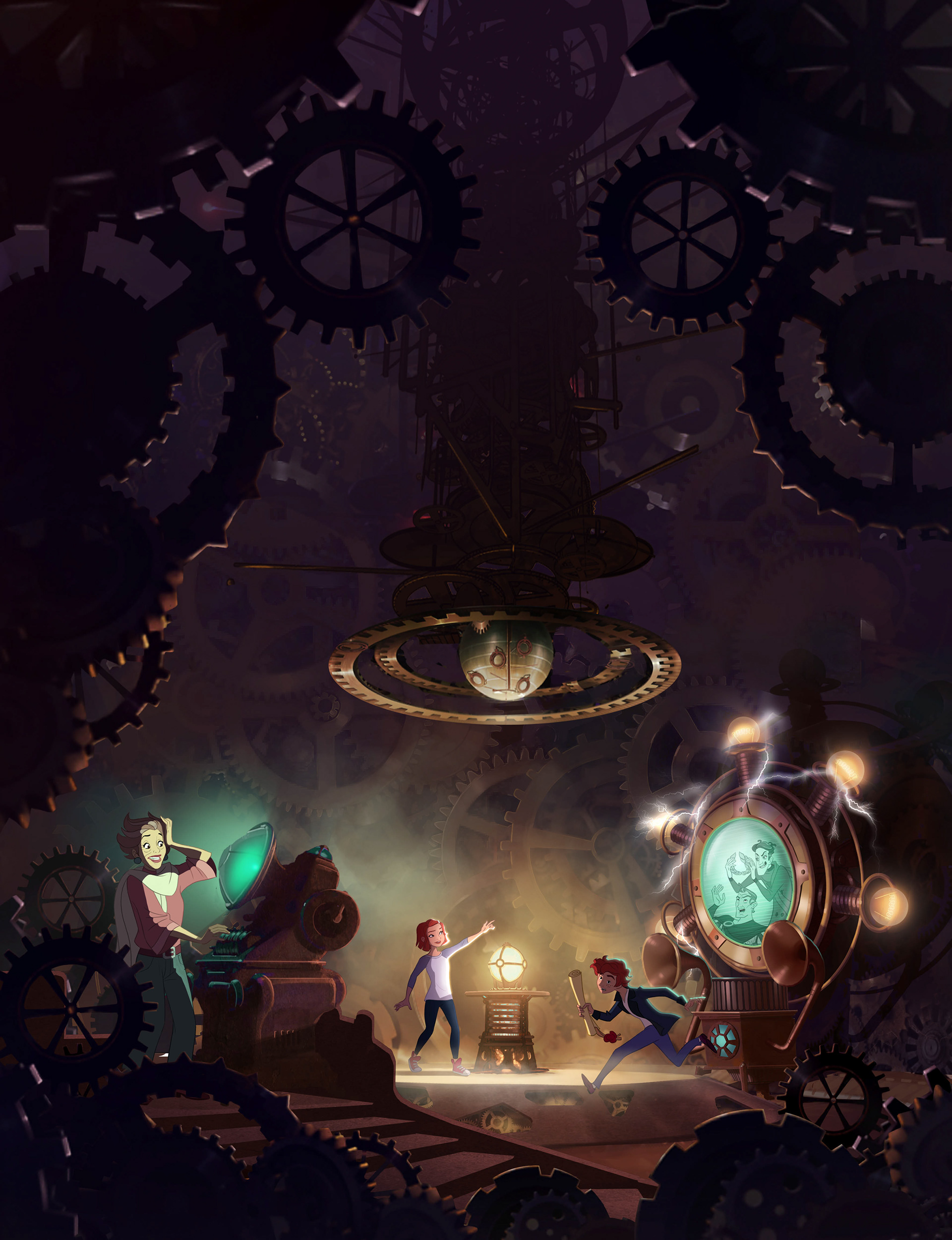
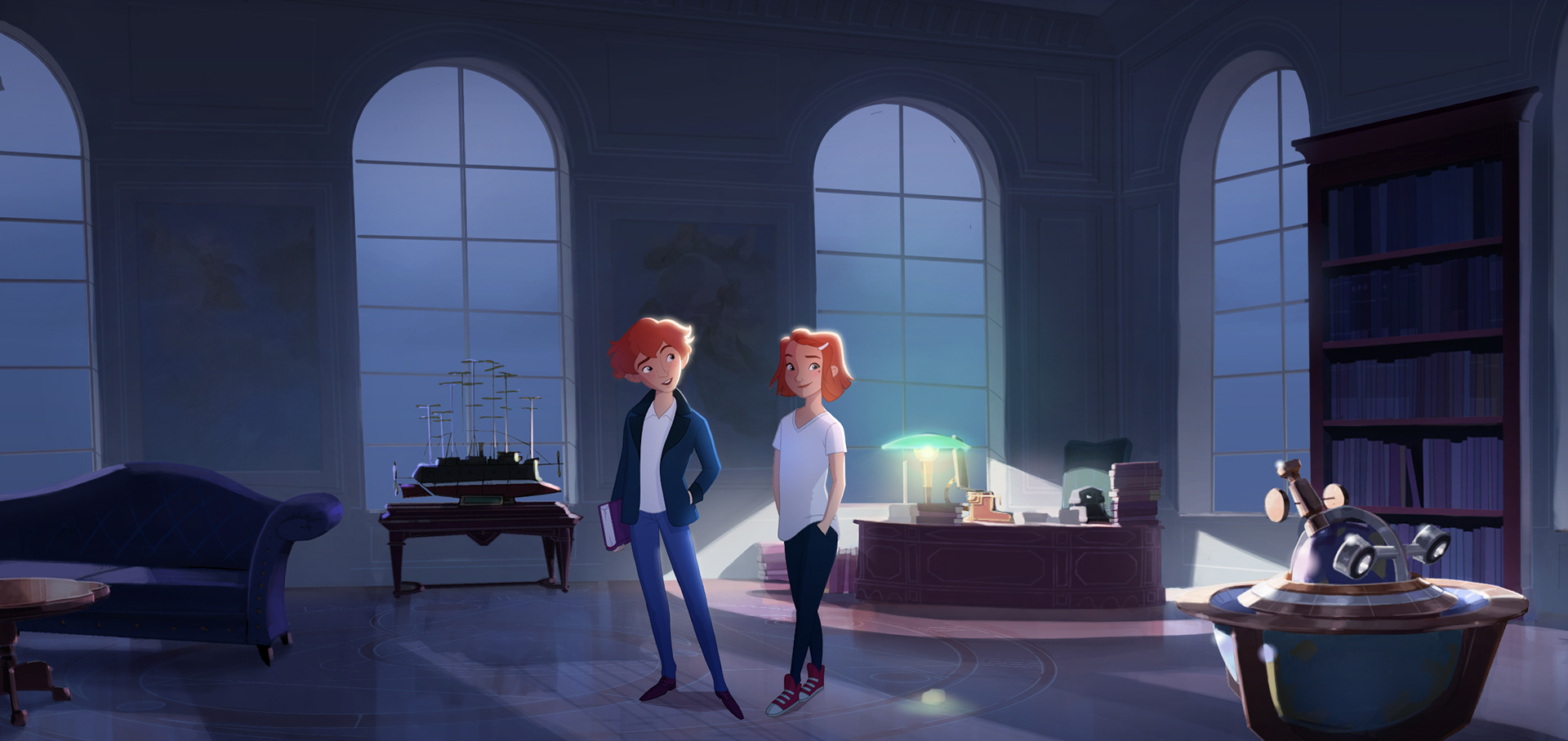
CGI with a Toon Shader Look
The characters and the background are built in 3D, but rendered and illuminated in a 2D style.
Art direction briefing for each era
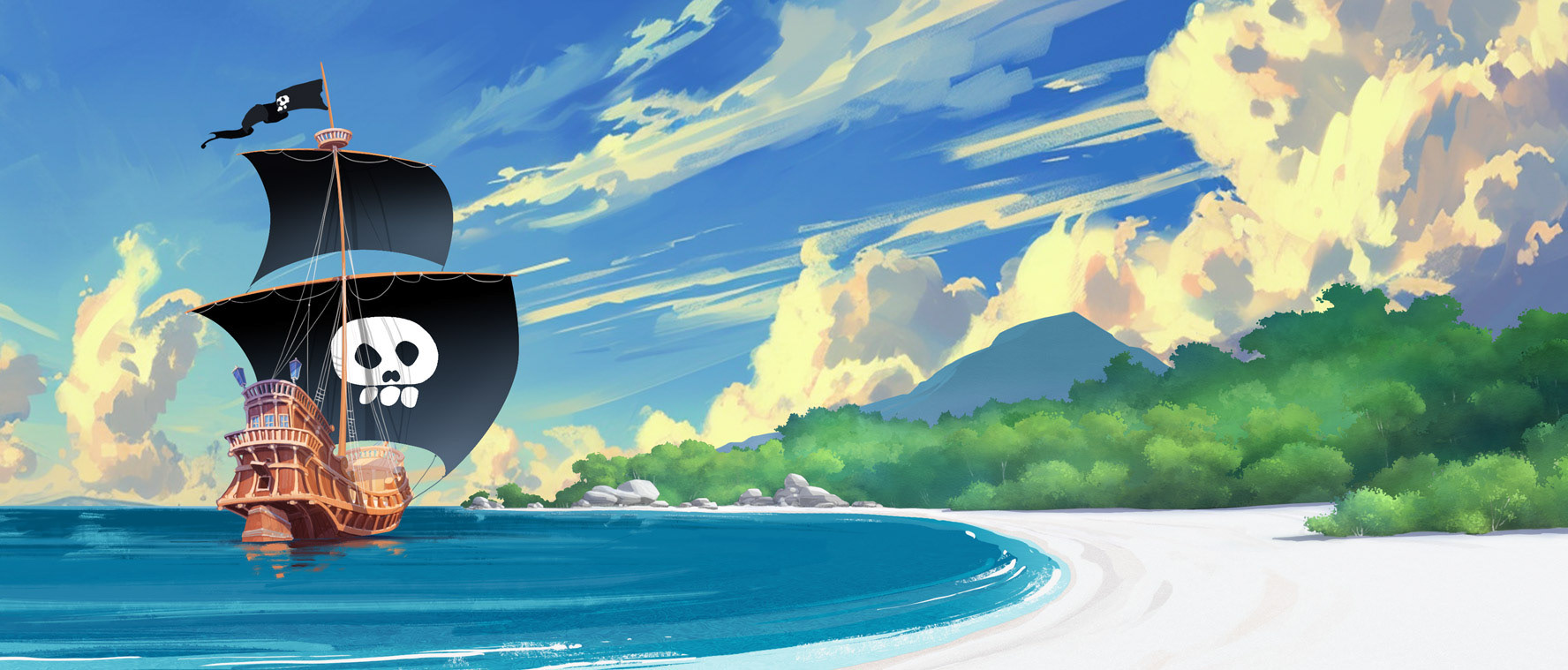
An art direction reference sheet was prepared for each episode to define the style elements, colours and lighting for each key set.
Defining the era and the corresponding style elements was essential as each one varied dramatically.
Defining the era and the corresponding style elements was essential as each one varied dramatically.
Work In Progress
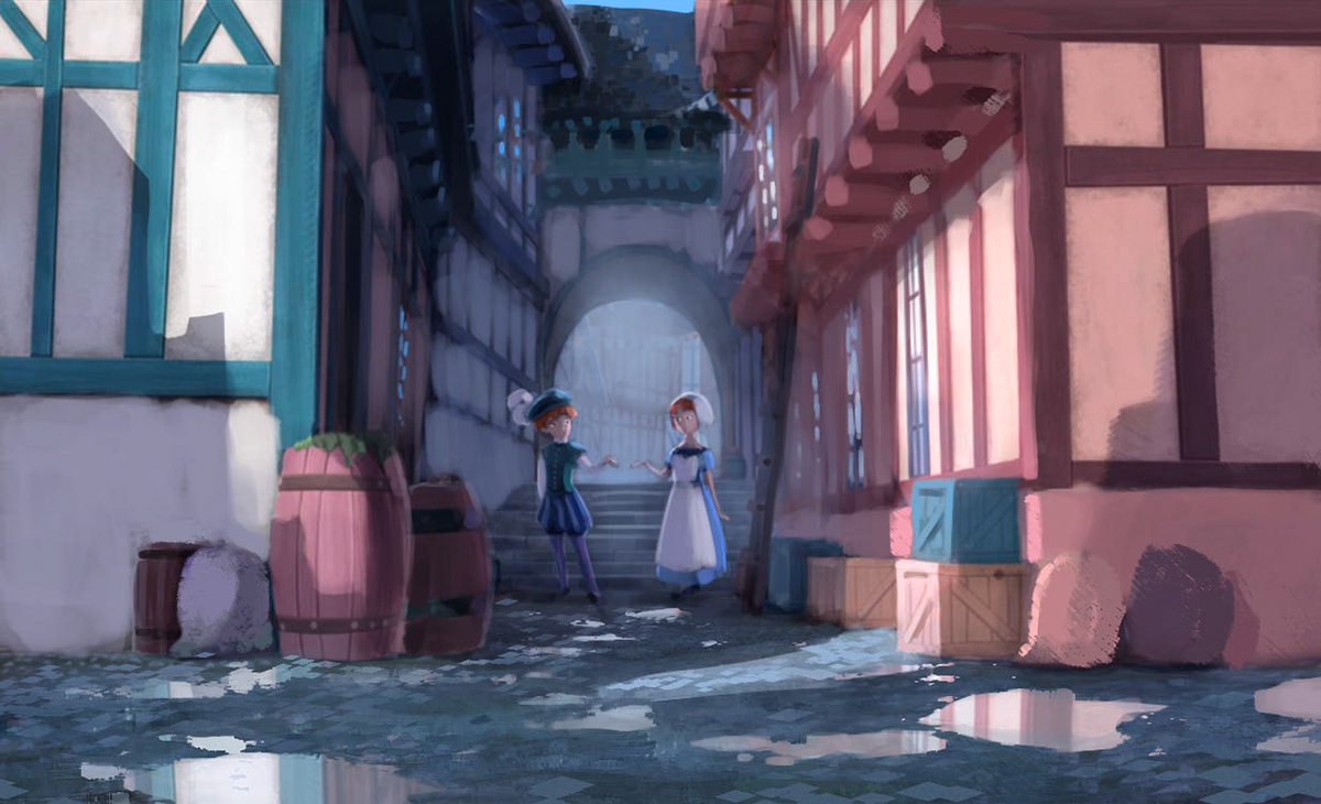
First steps in the colour concept of a set design in Venice at the time of Vivaldi.
Rough color and lighting concept of Edisons workspace.
STYLE GUIDE
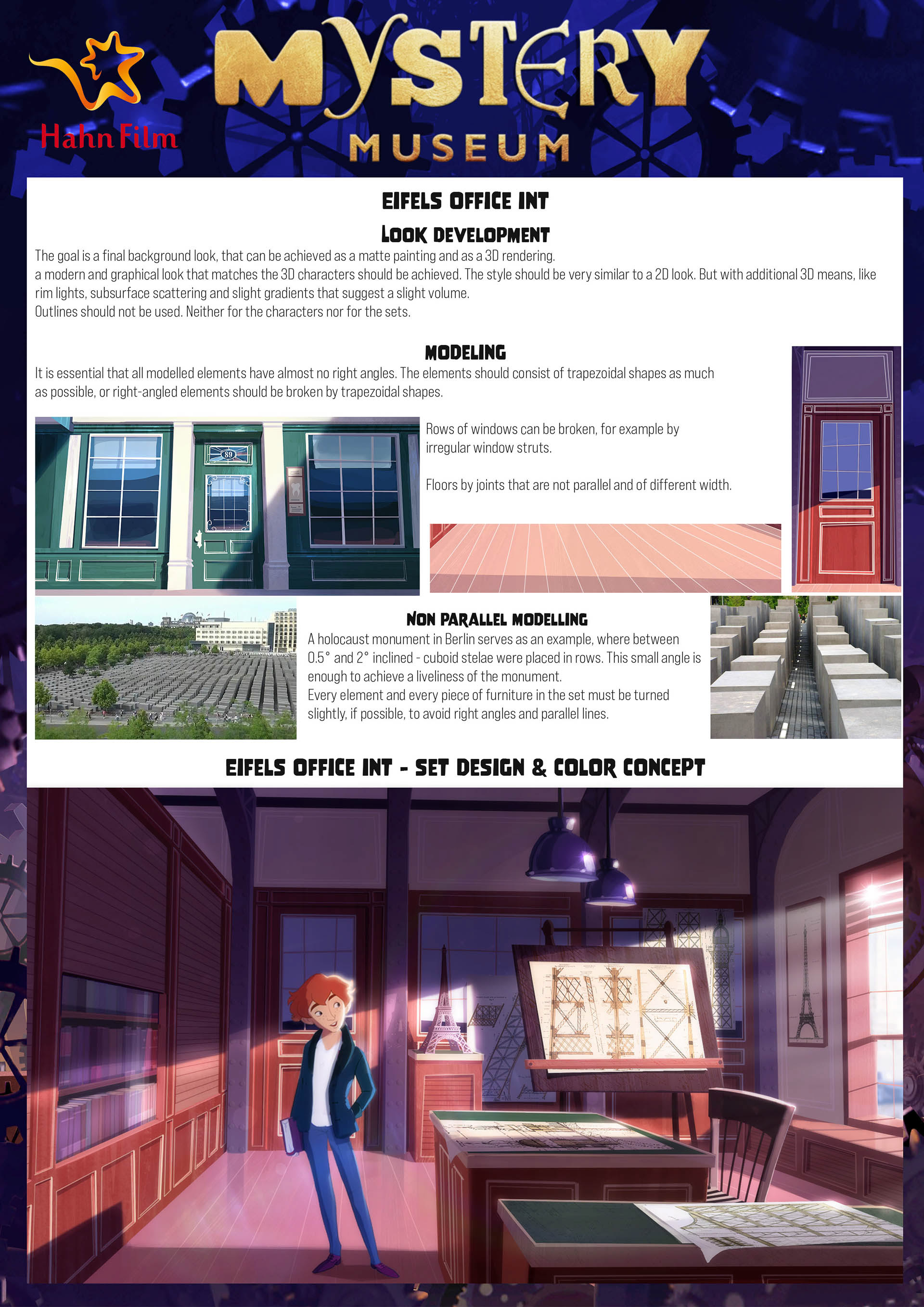
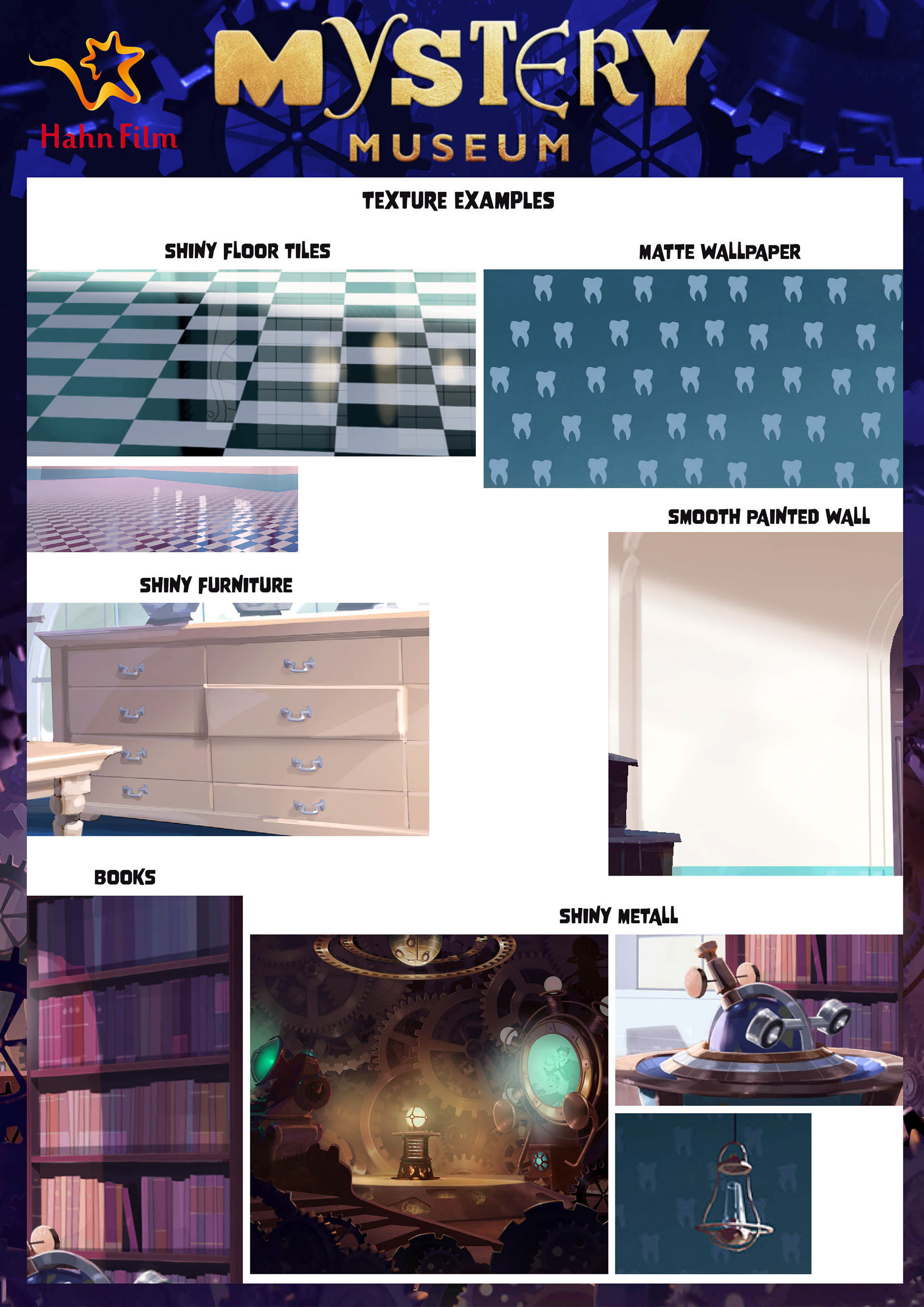
Here are a few individual examples of the style guide. As a production designer and art director, I usually create a style guide that covers as many aspects of the production as possible. Starting with the shapes, the look, the colours and textures, the lighting, the camera work, the camera lens set-up and the final grading. Every film has its own focus and this should be clear to all team members working on the production from the beginning in order to ensure a smooth production process.

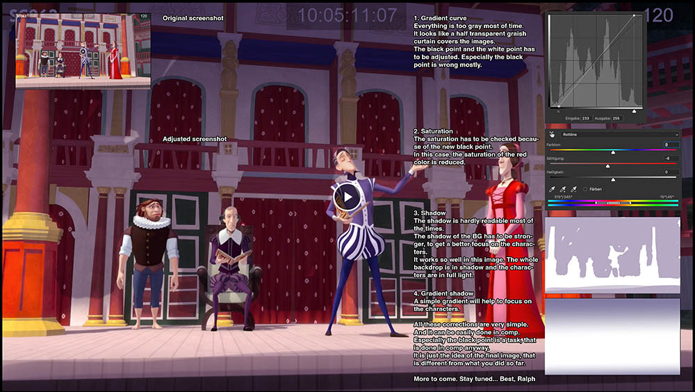
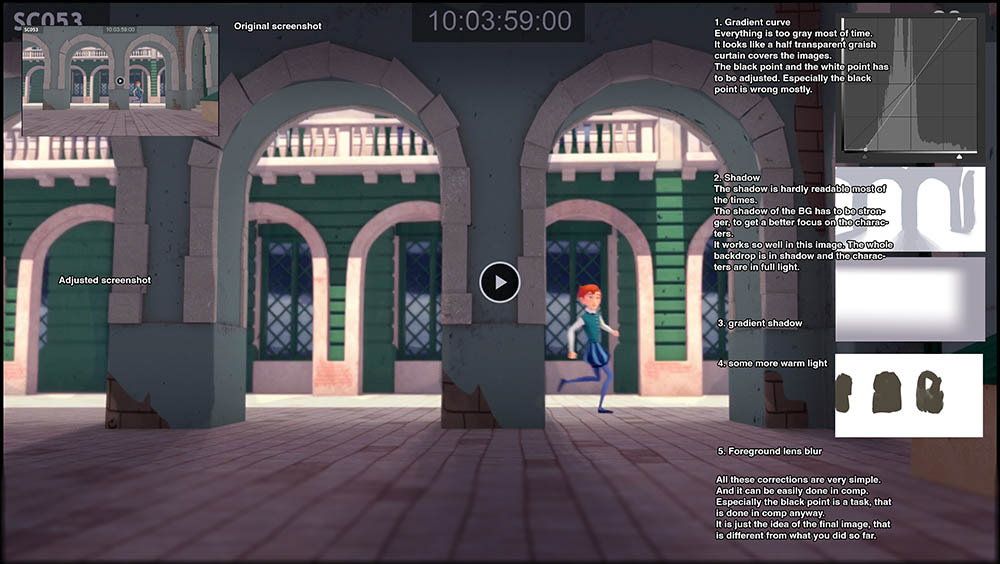
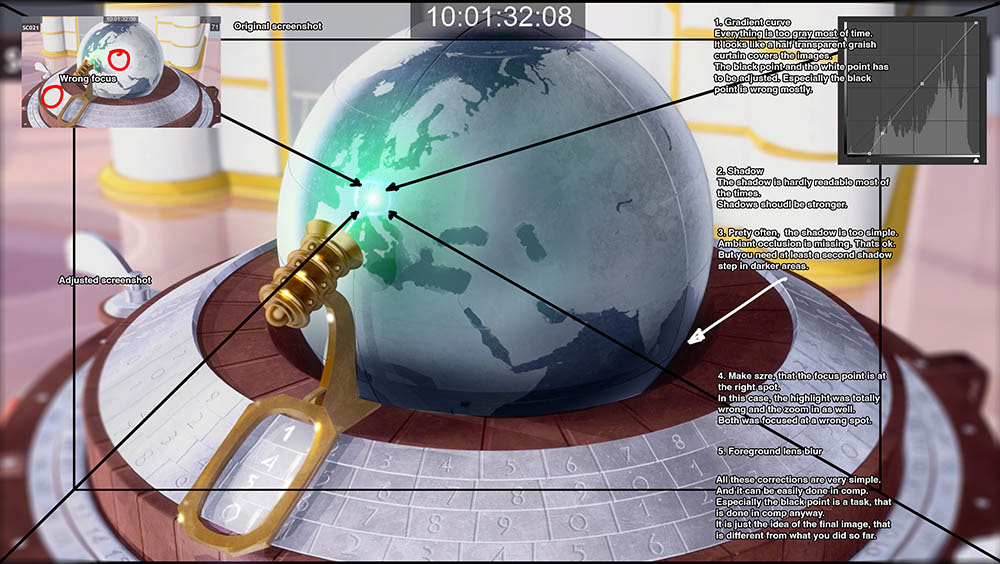
Compositing correction vs. linguistic misunderstandings
Here are a few individual examples of the style guide. As a production designer and art director, I usually create a style guide that covers as many aspects of the production as possible. Starting with the shapes, the look, the colours and textures, the lighting, the camera work, the camera lens set-up and the final grading. Every film has its own focus and this should be clear to all team members working on the production from the beginning in order to ensure a smooth production process.
In most cases, I work with quick paint overs to avoid any linguistic misunderstandings as far as possible. Linguistic misunderstandings arise very quickly if, for example, there is only one translator in a Chinese studio who translates all the emails. And very often they translate specialised texts from a field they know nothing about.
